This new Star Trek website lets you explore the bridge of every major iteration of the Enterprise
First reported by the Smithsonian Magazine, the Roddenberry Estate and Archive have collaborated with tech company OTOY to create a website with interactable, Google maps-style recreations of the various starships Enterprise from over the years, with some more obscure or one-off iterations just getting an external view and brief history summary.
Loading in, I immediately loved how the entire site is mocked up to look like an in-universe computer with that distinctive, midcentury Trek look of swooping, colorful blocks on a black background. Down below, you get a scrolling timeline of the starships Enterprise, beginning with the XCV-330 and ending with the unseen, but apparently canon "32nd Century" Enterprise briefly hinted at in an episode of Discovery.
The historical blurbs for each ship include in-universe notes, but I'm especially digging the real-life production background. The section on Next Gen's Enterprise D, for example, explains how the series initially had a set amount of footage of larger models built by the legendary special effects house, Industrial Light & Magic. That footage was used for establishing shots throughout the early seasons of Next Gen, before a smaller model was later commissioned for new footage later on.
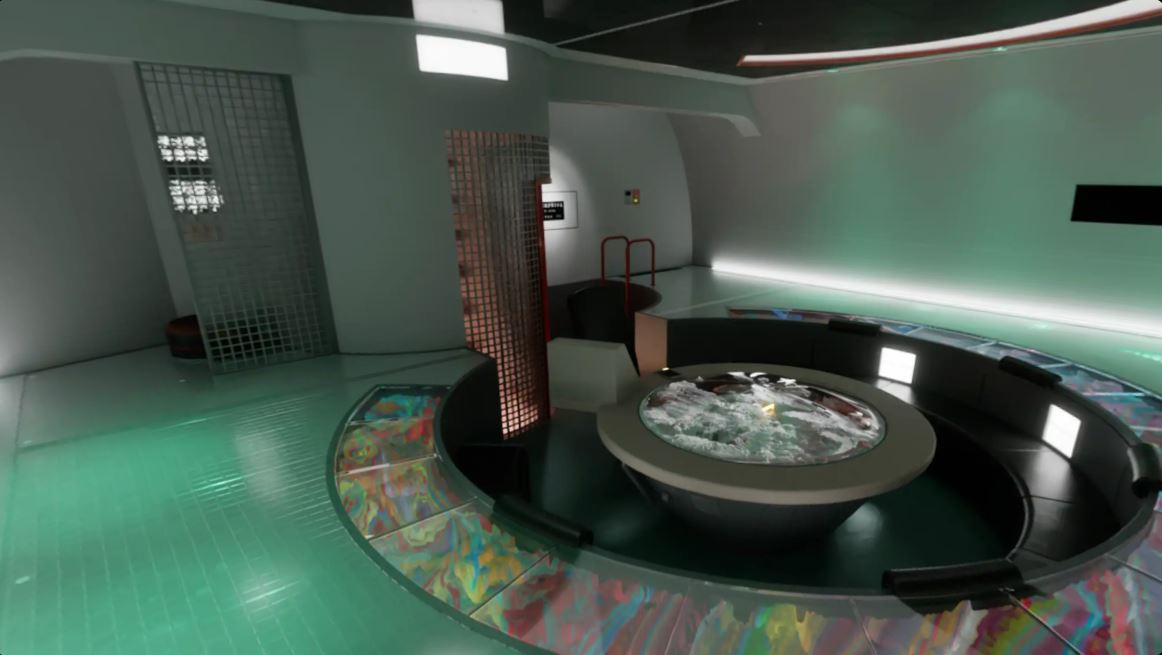
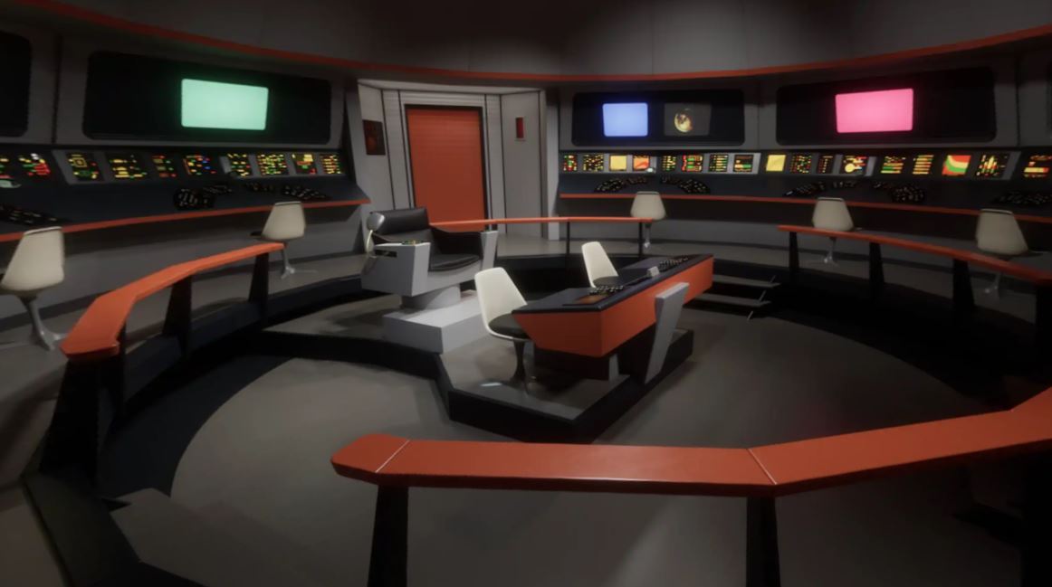
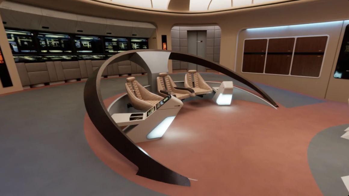
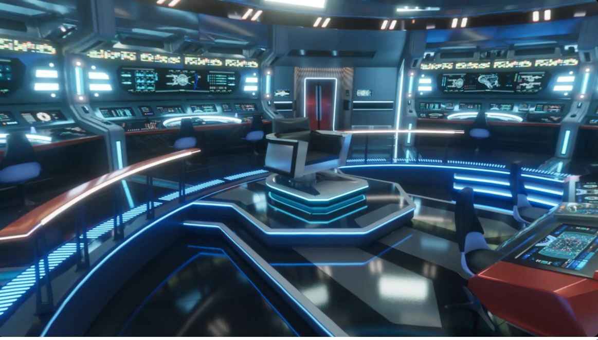
The real showstopper though is those digital recreations of the various bridges. It's honestly a thrill to see the evolution of Star Trek's visual language in such a condensed form, but the sleek, sparse sets of the early seasons and movies are still the winners in my book. For a single favorite, I gotta go with the Enterprise XCV-330, an early production concept for The Original Series later repurposed as a "historical" Enterprise in Star Trek's lore. Its exterior is very distinct from the rest, looking more like a NASA concept purpose-built for deep space travel and never meant to go in-atmosphere. It features a central fuselage suspended between two rings as opposed to the saucer-and-wings design we're more familiar with. Its bridge also has this psychedelic, surreal vibe that I can't get over. I'm similarly excited by the recreation of the Ralph McQuarrie-designed Enterprise from the first Trek movie that never was, Planet of the Titans.
It's a treat just to soak up the ambience in this Enterprise archive, and the site feels like a real throwback in a lot of ways—more bespoke, interactive websites like this and the Fortune's Run official site please! If Google Chrome is going to practically reach out through my screen and shake me down for more RAM, I expect to be dazzled.
from PCGamer latest https://ift.tt/N3FZfDc
First reported by the Smithsonian Magazine, the Roddenberry Estate and Archive have collaborated with tech company OTOY to create a website with interactable, Google maps-style recreations of the various starships Enterprise from over the years, with some more obscure or one-off iterations just getting an external view and brief history summary.


Loading in, I immediately loved how the entire site is mocked up to look like an in-universe computer with that distinctive, midcentury Trek look of swooping, colorful blocks on a black background. Down below, you get a scrolling timeline of the starships Enterprise, beginning with the XCV-330 and ending with the unseen, but apparently canon "32nd Century" Enterprise briefly hinted at in an episode of Discovery.
The historical blurbs for each ship include in-universe notes, but I'm especially digging the real-life production background. The section on Next Gen's Enterprise D, for example, explains how the series initially had a set amount of footage of larger models built by the legendary special effects house, Industrial Light & Magic. That footage was used for establishing shots throughout the early seasons of Next Gen, before a smaller model was later commissioned for new footage later on.
The real showstopper though is those digital recreations of the various bridges. It's honestly a thrill to see the evolution of Star Trek's visual language in such a condensed form, but the sleek, sparse sets of the early seasons and movies are still the winners in my book. For a single favorite, I gotta go with the Enterprise XCV-330, an early production concept for The Original Series later repurposed as a "historical" Enterprise in Star Trek's lore. Its exterior is very distinct from the rest, looking more like a NASA concept purpose-built for deep space travel and never meant to go in-atmosphere. It features a central fuselage suspended between two rings as opposed to the saucer-and-wings design we're more familiar with. Its bridge also has this psychedelic, surreal vibe that I can't get over. I'm similarly excited by the recreation of the Ralph McQuarrie-designed Enterprise from the first Trek movie that never was, Planet of the Titans.
It's a treat just to soak up the ambience in this Enterprise archive, and the site feels like a real throwback in a lot of ways—more bespoke, interactive websites like this and the Fortune's Run official site please! If Google Chrome is going to practically reach out through my screen and shake me down for more RAM, I expect to be dazzled.
via IFTTT

Post a Comment