Designing a complete desk aesthetic around your PC is truly satisfying
I've seen the light, and it is #FFFFFF. After years of building black, windowless obelisk PCs, I'm now smitten with my new white case and how well it matches my desk. It's a fun angle on PC building I hadn't considered too much before: not just paying attention to how tidy and stylish the PC looks on the inside, but how it fits with the rest of my setup.
If you've had the itch to build a new PC but have been holding off because of GPU and CPU shortages, building a more aesthetic PC+desk combo is a great alternative. Just a new case can make a big difference—although if you're like me, one upgrade may snowball into thinking about all the other things you could do to class up your desk and make it better fit with the room it lives in.
Building a new standing desk was the catalyst for me. I had a nice light birch wood top which for years had been sitting on black legs and a cheap black Ikea shelf. I decided to switch to white legs, then got a new white filing cabinet to go with the desk. I love how clean the white hardware looks. And because my desk is in the living room, it fits better with our natural light white moulding around the doors and windows, too. Looking under the desk, the black PC really stood out—black cables are kind of inevitable, but the PC case I could do something about.
Color is the key
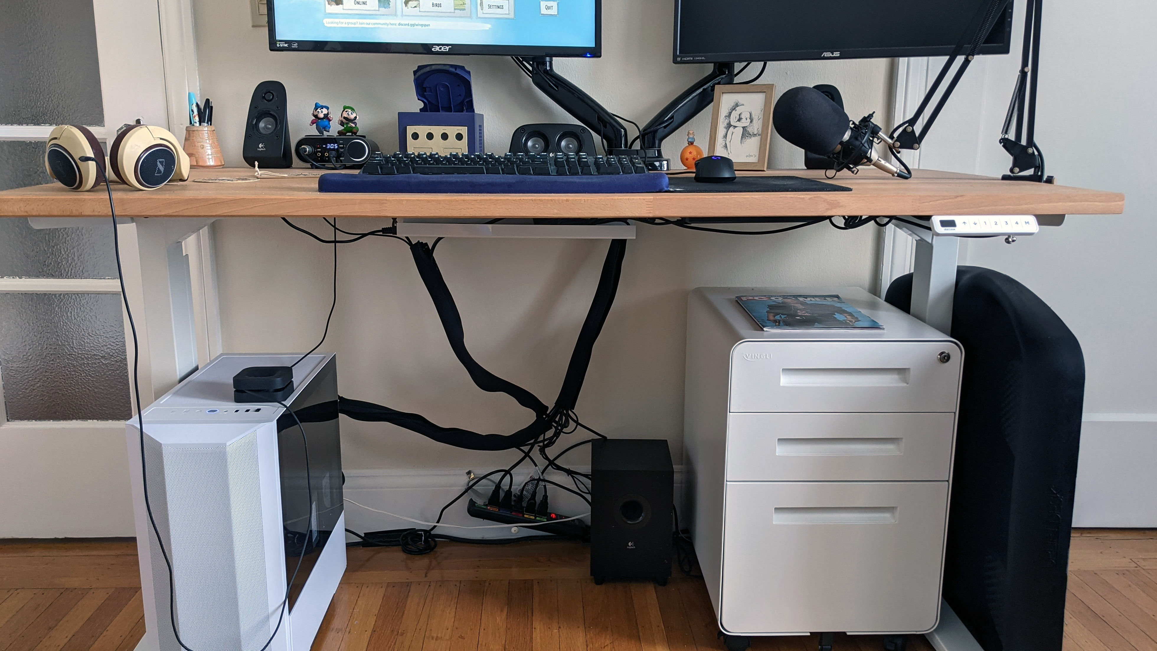
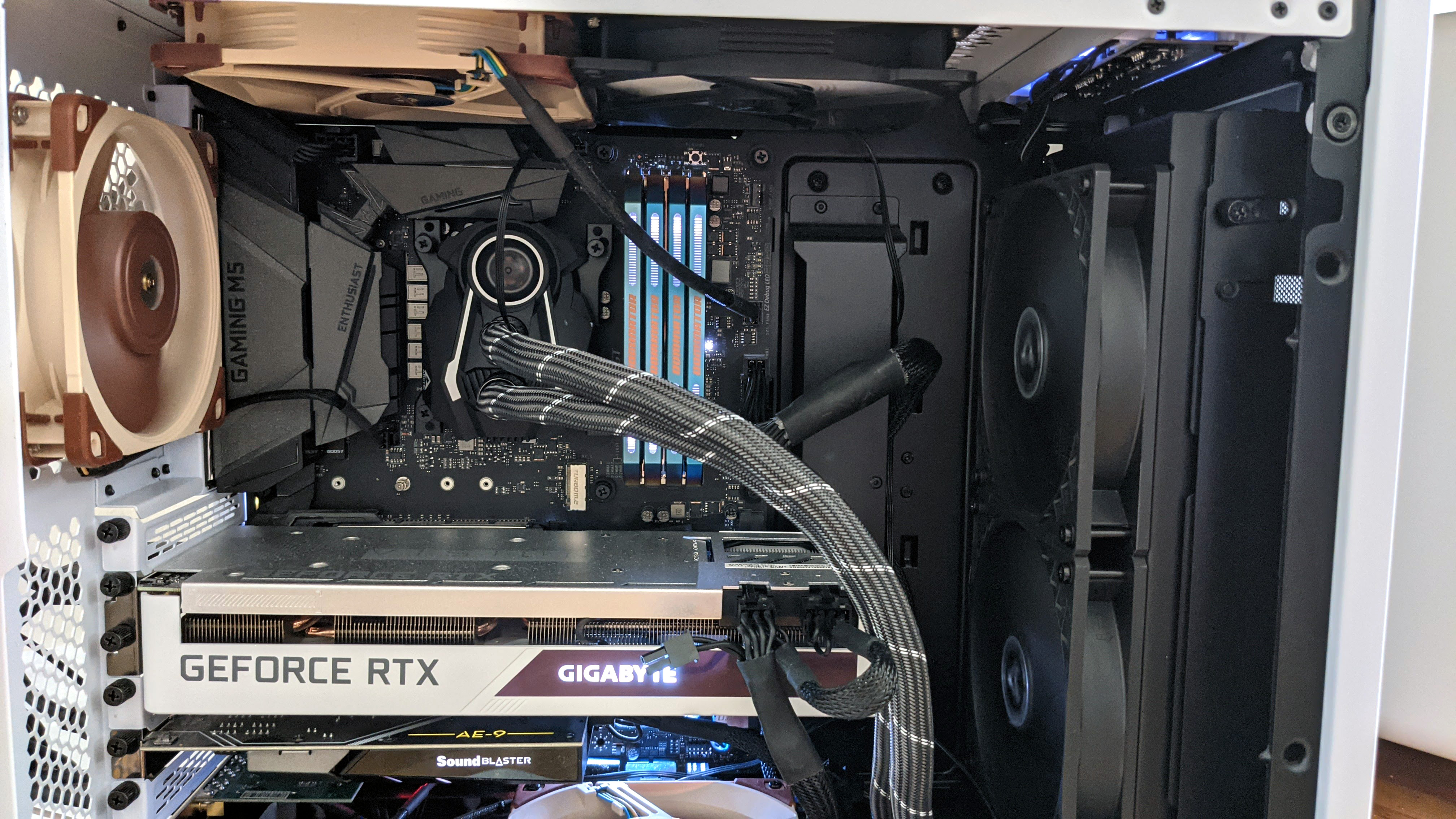

I wanted a case with room for a thick 280mm Arctic cooler, so I bought the white Lian Li Lancool 2 Mesh and transferred my PC over. The white case actually pairs beautifully with my Gigabyte RTX 3070 Vision graphics card and the white LEDs on my RAM. If I got a white motherboard, I'd really be in business (although I'll never give up my brown Noctua fans). Fully customizing your PC interior is a whole topic by itself that I'll probably put more effort into next time I do a significant upgrade.
Even with just the case swap, every day I sit down at my desk I'm pleased with how nice it looks together. The Lancool 2 Mesh's tinted side panels give the case a white and black combo that pairs well with my subwoofer and the black hardware on top of my desk. I wish I'd thought about a white monitor arm, but maybe some new white speakers are in my future. This is a new desk in a new apartment for me, so I'll be doing a lot of fiddling with it in the months ahead. And this is an amateur setup compared to what you'll find from PC gamers who have put tons of thought into everything surrounding their desks.
Reddit's grand temple of PC building, /r/battlestations, is filled with popular posts showcasing PCs and entire rooms ablaze with RGB lights, and multi-monitor setups that I can't imagine actually using day-to-day without ruining my neck. They're sure impressive, though!
Alongside the flashiest battlestation posts are tons of beautiful gaming setups that offer a more practical takeaway: showing just how effective matching up the colors around your desk can be. It's a great place to look for inspiration. Here are some of my favorites, and what I learned from them.
Stick to white and colors will really pop
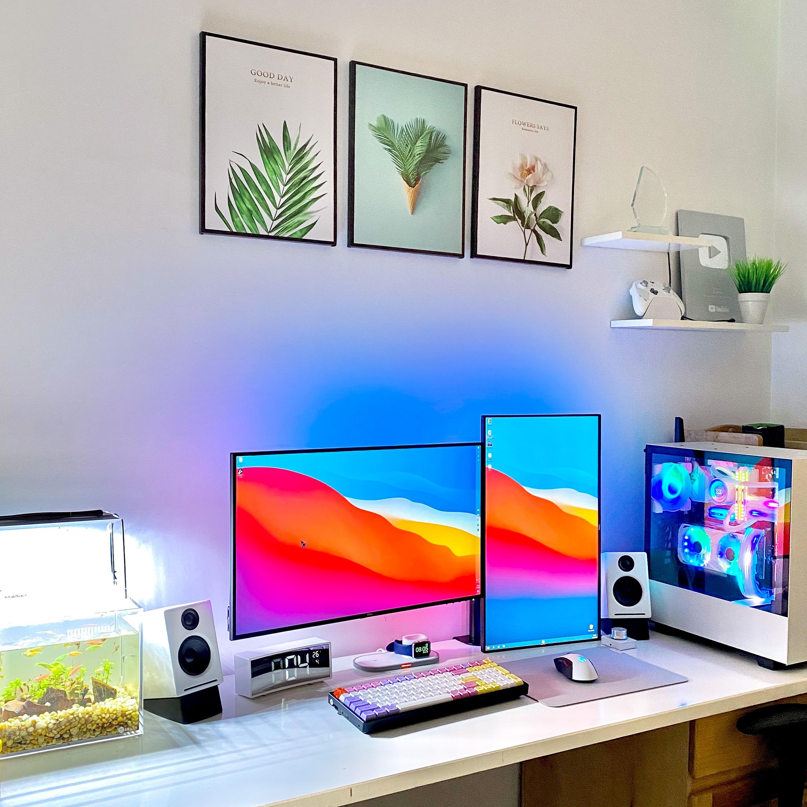
Redditor leh0ang's desk here is maybe a touch removed from minimalist, but the abundance of white hardware and decor really makes it work. Look at how well the NZXT PC case's B&W design matches the thin bezels of the monitors, the speakers, and even the mouse. That theme continues to the framed photos above their desk and the shelves to the right. Even the Xbox controller is white.
The really pro move here, though, is the predominately white keyboard, with splashes of red, yellow and purple accenting that match the desktop. Beautiful. It also avoids being too white, which is possible (unless you enjoy your desk looking like it belongs in an art house sci-fi movie).
Accent colors look great with black
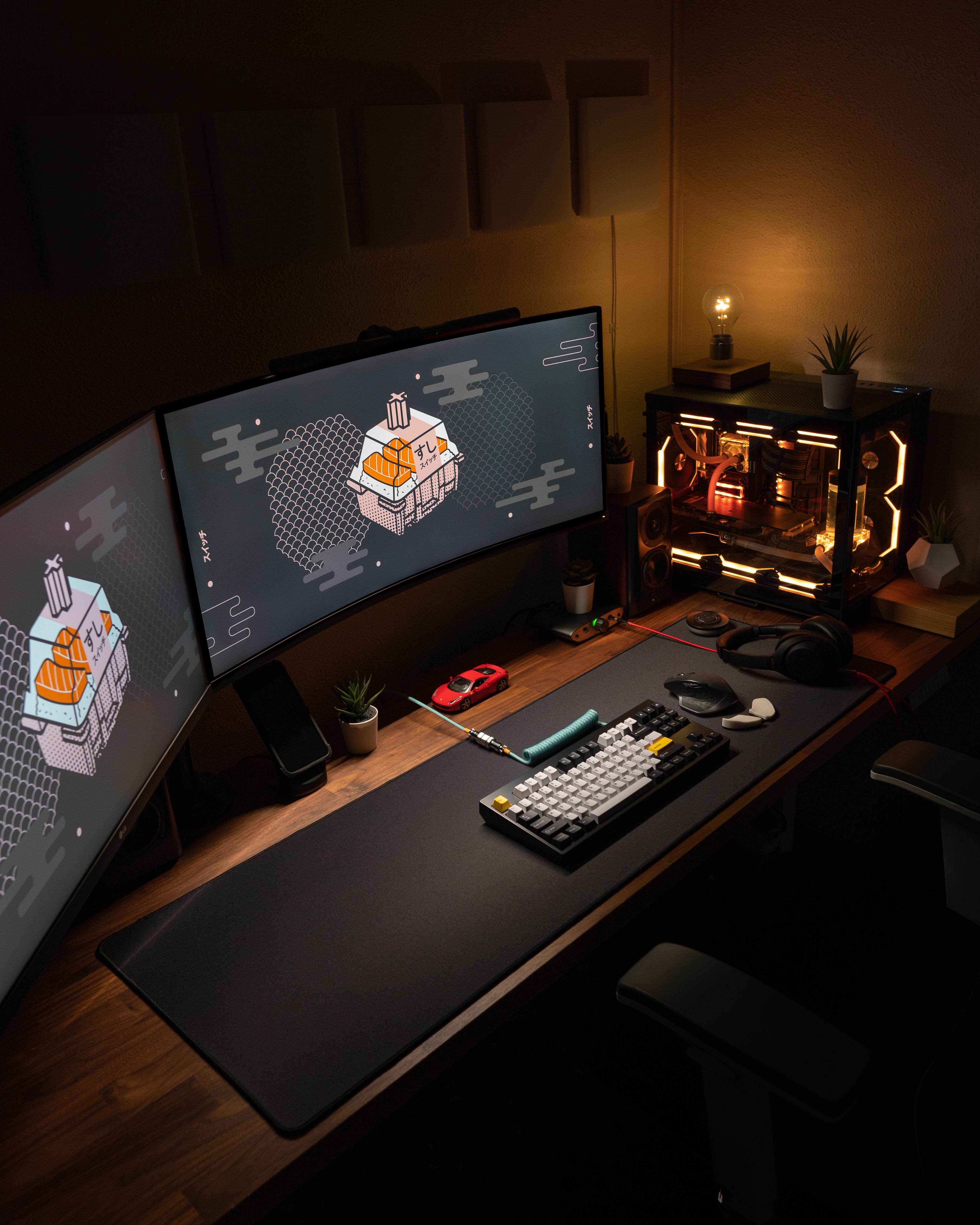
I'm in love with the perfect, subtle uses of color at Redditor dailysetuptech's desk. First, the obvious lighting: the yellow tint on the case RGBs will be easier on the eyes late at night than bright white or blue, and the lightbulb lamp (which freaking levitates) is an equally warm light. RGBs tend to look harsh and digital, but the warm lighting here along with the nice wooden desk makes the whole setup feel especially cozy.
There are a couple brilliant accent colors on the desk, too. First, the yellow Escape and Enter keys on the keyboard, which tie it to the PC's lighting. And then my favorite bit: the red headphone cable and the red toy Ferrari parked under the monitors. Nailed it.
Embrace the wood grain
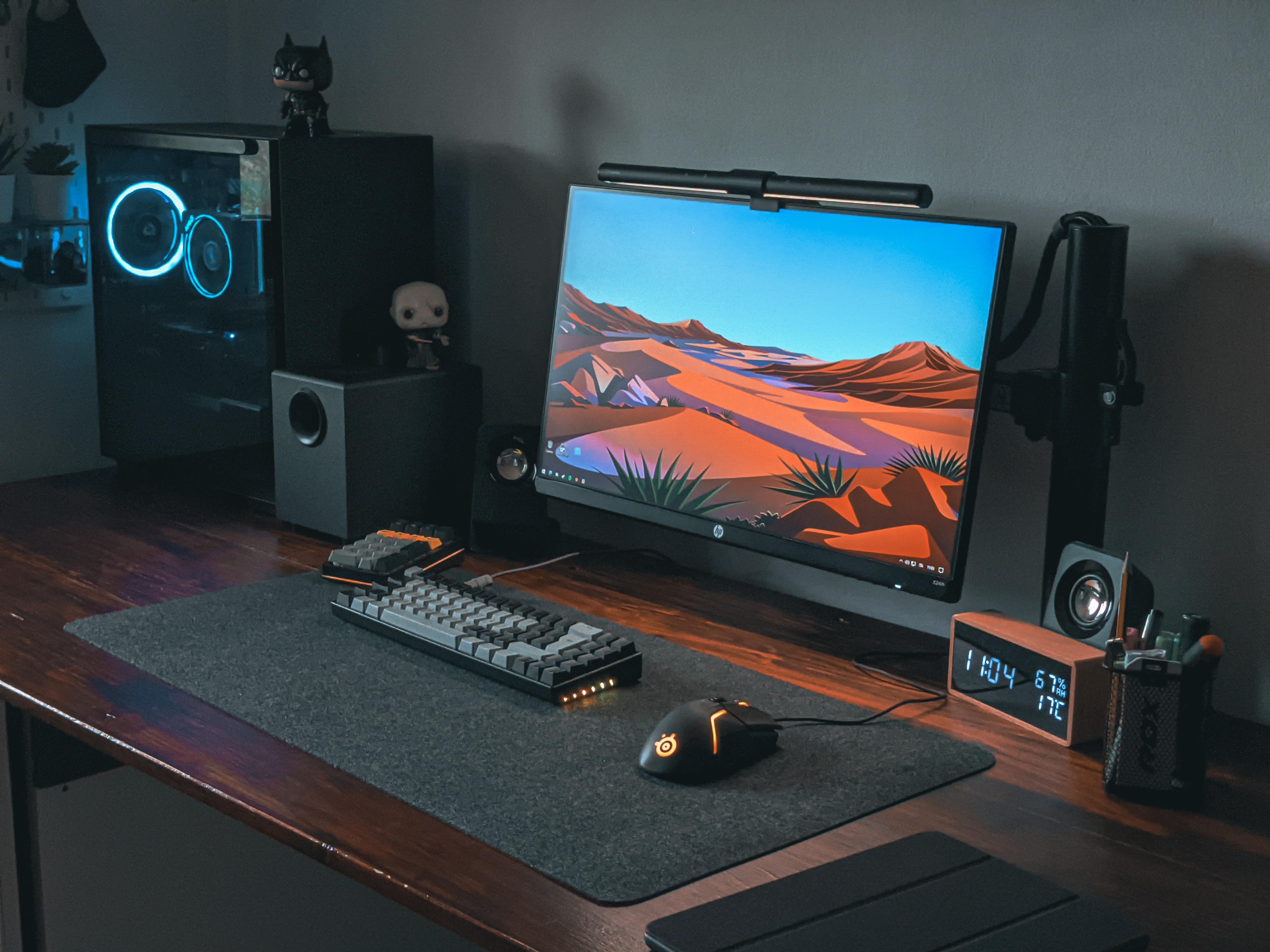
Here are a pair of examples from Redditors mrnovarexo and SkweezyJibsss, who each used wood as a key accent on their desks. Both have dark, reddish brown desks, and you can see how mrnovarexo kept almost everything at their desk black and grey except for a few splashes of color that really go with the wood. There's the orange glow of the mouse RGB, the orange row of keys on the numpad, and then the desert wallpaper, perfectly matched with the clock off to the side. If there's one thing I've picked up on from trawling r/battlestations, it's that I really need a stylish clock on my desk.
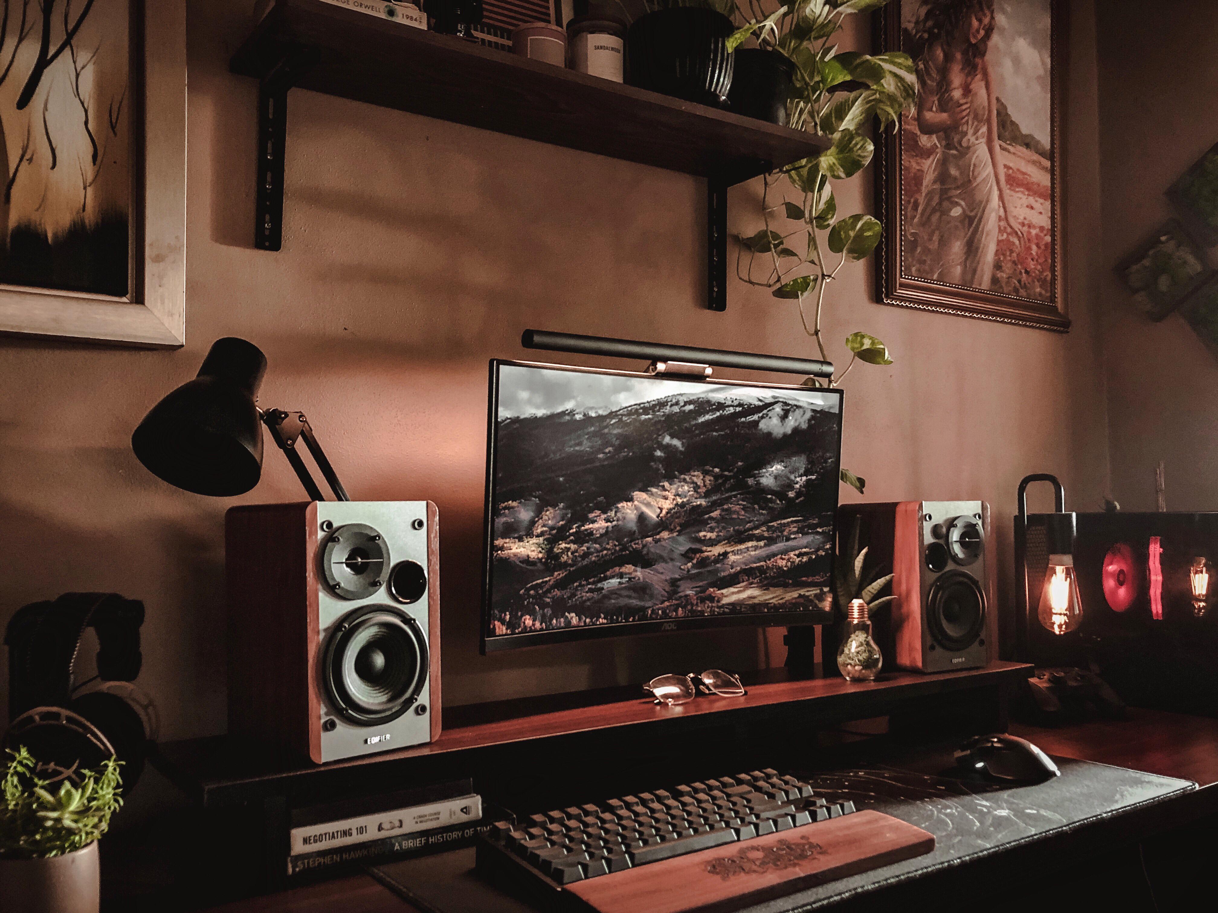
SkweezyJibsss' setup really leans into the more rustic look wood can support, including a nice potted pothos plant, the framed paintings and the exposed bulb lamp. The pro touches here are the custom wood wrist rest for the keyboard and the wood paneled Edifier speakers (all it's really missing is a laser-cut wood PC case). I can only hope that there's a leather smoking chair just out of frame.
Get creative and pick a theme
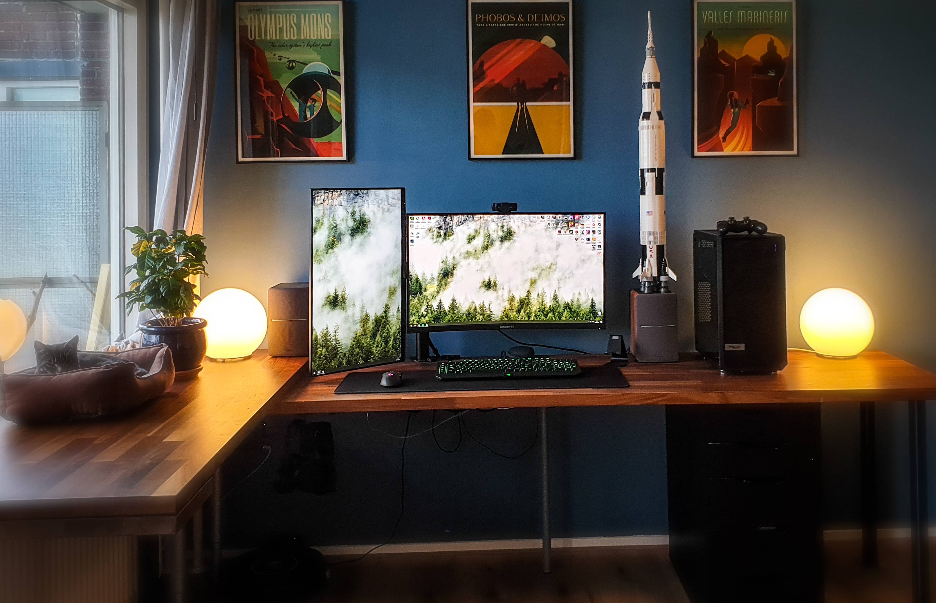
Other than some color coordination, I don't have a theme at my desk—my GameCube organizer and little Mario figures don't exactly gel with the Space Runaway Ideon poster on my wall. But Redditor Distinquish offers a great example of how to tie together a whole desk thematically with the Lego Saturn V rocket and framed SpaceX art deco posters. Even the Ikea orb lamps match the planetary vibe. The color coordination is on point, too, between the desk plant and the foresty wallpaper. And having enough desk space for a cat? Major bonus points.
Think about the rest of your room, too
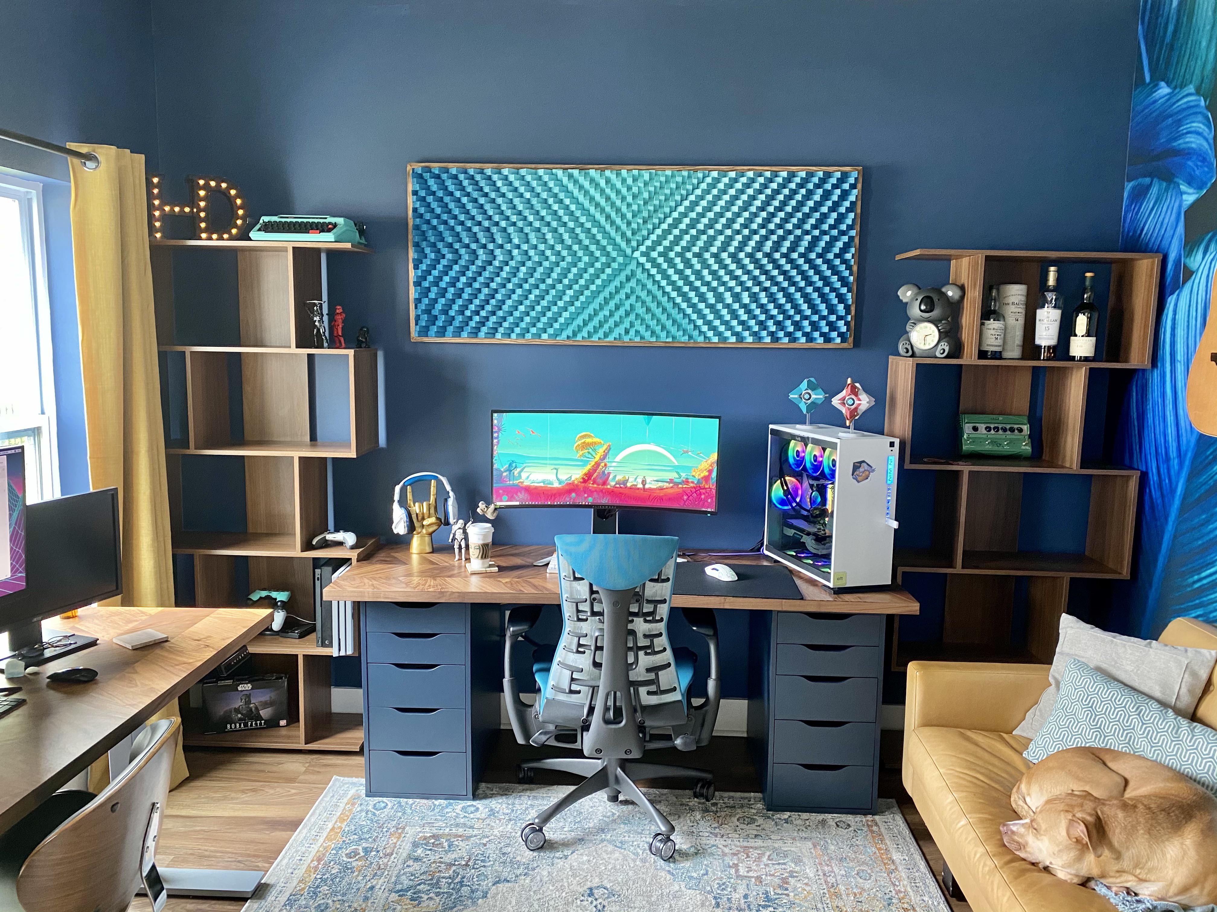
Whether your desk is in your bedroom or living room or office, think about how you can integrate it, and your PC, with its surroundings. Here's a really nice room from Redditor CuPc8K3, who clearly thought about a broader aesthetic than my measly combo of white desk and white PC case. Look at everything going on here:
- Yellow and teal are the primary colors for the room, right down to the carpet. CuPc8K3 even cited a specific color palette as inspiration.
- The chair, wallpaper, framed sound diffuser, typewriter, painted wall, couch throw pillow, one of the Destiny figures and the PC's front panel LED all match
- The yellow curtains and couch do a nice job of balancing the color on each side of the room
- The symmetrical shelves are just damn nice to look at
- The gray-blue desk drawers are a close match for the wall paint and blend in well
- Dog!
Put this kind of effort into the area around your desk and you'll enjoy spending time in your gaming space that much more.
from PCGamer latest https://ift.tt/3aScuFf
I've seen the light, and it is #FFFFFF. After years of building black, windowless obelisk PCs, I'm now smitten with my new white case and how well it matches my desk. It's a fun angle on PC building I hadn't considered too much before: not just paying attention to how tidy and stylish the PC looks on the inside, but how it fits with the rest of my setup.
If you've had the itch to build a new PC but have been holding off because of GPU and CPU shortages, building a more aesthetic PC+desk combo is a great alternative. Just a new case can make a big difference—although if you're like me, one upgrade may snowball into thinking about all the other things you could do to class up your desk and make it better fit with the room it lives in.
Building a new standing desk was the catalyst for me. I had a nice light birch wood top which for years had been sitting on black legs and a cheap black Ikea shelf. I decided to switch to white legs, then got a new white filing cabinet to go with the desk. I love how clean the white hardware looks. And because my desk is in the living room, it fits better with our natural light white moulding around the doors and windows, too. Looking under the desk, the black PC really stood out—black cables are kind of inevitable, but the PC case I could do something about.
Color is the key


I wanted a case with room for a thick 280mm Arctic cooler, so I bought the white Lian Li Lancool 2 Mesh and transferred my PC over. The white case actually pairs beautifully with my Gigabyte RTX 3070 Vision graphics card and the white LEDs on my RAM. If I got a white motherboard, I'd really be in business (although I'll never give up my brown Noctua fans). Fully customizing your PC interior is a whole topic by itself that I'll probably put more effort into next time I do a significant upgrade.
Even with just the case swap, every day I sit down at my desk I'm pleased with how nice it looks together. The Lancool 2 Mesh's tinted side panels give the case a white and black combo that pairs well with my subwoofer and the black hardware on top of my desk. I wish I'd thought about a white monitor arm, but maybe some new white speakers are in my future. This is a new desk in a new apartment for me, so I'll be doing a lot of fiddling with it in the months ahead. And this is an amateur setup compared to what you'll find from PC gamers who have put tons of thought into everything surrounding their desks.
Reddit's grand temple of PC building, /r/battlestations, is filled with popular posts showcasing PCs and entire rooms ablaze with RGB lights, and multi-monitor setups that I can't imagine actually using day-to-day without ruining my neck. They're sure impressive, though!
Alongside the flashiest battlestation posts are tons of beautiful gaming setups that offer a more practical takeaway: showing just how effective matching up the colors around your desk can be. It's a great place to look for inspiration. Here are some of my favorites, and what I learned from them.
Stick to white and colors will really pop

Redditor leh0ang's desk here is maybe a touch removed from minimalist, but the abundance of white hardware and decor really makes it work. Look at how well the NZXT PC case's B&W design matches the thin bezels of the monitors, the speakers, and even the mouse. That theme continues to the framed photos above their desk and the shelves to the right. Even the Xbox controller is white.
The really pro move here, though, is the predominately white keyboard, with splashes of red, yellow and purple accenting that match the desktop. Beautiful. It also avoids being too white, which is possible (unless you enjoy your desk looking like it belongs in an art house sci-fi movie).
Accent colors look great with black

I'm in love with the perfect, subtle uses of color at Redditor dailysetuptech's desk. First, the obvious lighting: the yellow tint on the case RGBs will be easier on the eyes late at night than bright white or blue, and the lightbulb lamp (which freaking levitates) is an equally warm light. RGBs tend to look harsh and digital, but the warm lighting here along with the nice wooden desk makes the whole setup feel especially cozy.
There are a couple brilliant accent colors on the desk, too. First, the yellow Escape and Enter keys on the keyboard, which tie it to the PC's lighting. And then my favorite bit: the red headphone cable and the red toy Ferrari parked under the monitors. Nailed it.
Embrace the wood grain


Here are a pair of examples from Redditors mrnovarexo and SkweezyJibsss, who each used wood as a key accent on their desks. Both have dark, reddish brown desks, and you can see how mrnovarexo kept almost everything at their desk black and grey except for a few splashes of color that really go with the wood. There's the orange glow of the mouse RGB, the orange row of keys on the numpad, and then the desert wallpaper, perfectly matched with the clock off to the side. If there's one thing I've picked up on from trawling r/battlestations, it's that I really need a stylish clock on my desk.
SkweezyJibsss' setup really leans into the more rustic look wood can support, including a nice potted pothos plant, the framed paintings and the exposed bulb lamp. The pro touches here are the custom wood wrist rest for the keyboard and the wood paneled Edifier speakers (all it's really missing is a laser-cut wood PC case). I can only hope that there's a leather smoking chair just out of frame.
Get creative and pick a theme

Other than some color coordination, I don't have a theme at my desk—my GameCube organizer and little Mario figures don't exactly gel with the Space Runaway Ideon poster on my wall. But Redditor Distinquish offers a great example of how to tie together a whole desk thematically with the Lego Saturn V rocket and framed SpaceX art deco posters. Even the Ikea orb lamps match the planetary vibe. The color coordination is on point, too, between the desk plant and the foresty wallpaper. And having enough desk space for a cat? Major bonus points.
Think about the rest of your room, too

Whether your desk is in your bedroom or living room or office, think about how you can integrate it, and your PC, with its surroundings. Here's a really nice room from Redditor CuPc8K3, who clearly thought about a broader aesthetic than my measly combo of white desk and white PC case. Look at everything going on here:
- Yellow and teal are the primary colors for the room, right down to the carpet. CuPc8K3 even cited a specific color palette as inspiration.
- The chair, wallpaper, framed sound diffuser, typewriter, painted wall, couch throw pillow, one of the Destiny figures and the PC's front panel LED all match
- The yellow curtains and couch do a nice job of balancing the color on each side of the room
- The symmetrical shelves are just damn nice to look at
- The gray-blue desk drawers are a close match for the wall paint and blend in well
- Dog!
Put this kind of effort into the area around your desk and you'll enjoy spending time in your gaming space that much more.
via IFTTT

Post a Comment